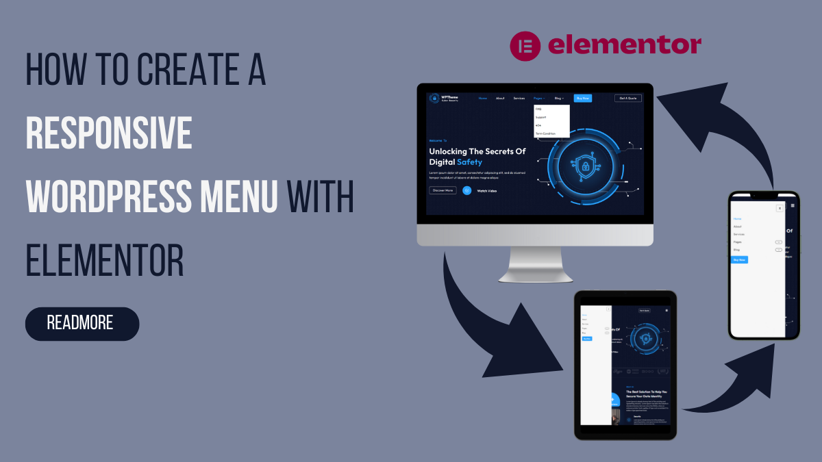
In web design, a responsive and user-friendly menu is a cornerstone of a successful website. If you’re a WordPress user harnessing the power of Elementor, you’re in for a treat. Creating a responsive WordPress menu with Elementor can elevate your site’s navigation experience to new heights, ensuring that visitors can seamlessly explore your content across various devices.
In this blog, we will delve into the art of crafting a menu that not only adapts to different screen sizes but also aligns with the aesthetics of your website. Elementor, the popular drag-and-drop page builder for WordPress, provides a robust platform to design and customize your site’s elements, and the menu is no exception.
We’ll explore the key features of Elementor that empower you to design a menu that not only looks visually appealing but also functions seamlessly on desktops, tablets, and mobile devices.
Get ready to unlock the potential of Elementor and revolutionize your website’s navigation. By the end of this blog, you’ll have a responsive WordPress menu that enhances user experience and sets your website apart in the crowded online space.
What Is The Responsive Navigation Menu?
A responsive navigation menu is a crucial component of web design that adapts and optimizes its layout and functionality based on the user’s device screen size. In essence, it ensures a seamless and user-friendly experience across a spectrum of devices, such as desktops, tablets, and mobile phones. The primary goal is to make navigation intuitive, regardless of the screen real estate available to the user.
At its core, a responsive navigation menu adjusts its design and structure to accommodate different screen sizes. This adaptability is essential in today’s digital landscape, where users access websites through an array of devices with varying screen dimensions. Traditional menus designed for larger screens may become impractical and visually challenging on smaller devices, hindering the user experience. A responsive navigation menu addresses this challenge by presenting an optimized version tailored to each device, ensuring ease of use and accessibility.
Significance Of Having A Responsive WordPress Menu
A responsive WordPress mega menu is not just a design element; it’s a strategic component that significantly influences the user experience and overall success of your website. Here’s a detailed exploration of the key significance of having a responsive WordPress menu on your site:
- Improved User Experience: A responsive WordPress menu adapts seamlessly to different screen sizes, offering a consistent and user-friendly experience. Whether your audience is accessing your site on a desktop, tablet, or smartphone, a well-designed responsive menu ensures that navigation remains intuitive. Users can effortlessly explore your website, find relevant information, and engage with your content, fostering a positive and lasting impression.
- Accessibility Across Devices: With the proliferation of smartphones and tablets, users expect a website to be accessible on any device they choose. A responsive menu guarantees that your site maintains functionality and aesthetics on various screen sizes. It eliminates the need for separate mobile or desktop versions, streamlining your web presence and making it easier to manage and maintain.
- SEO Benefits: Search engines, such as Google, prioritize mobile-friendly websites in their rankings. Having a responsive WordPress menu contributes to the overall mobile responsiveness of your site, positively influencing its search engine ranking. Improved SEO performance can result in higher visibility, increased organic traffic, and a broader reach for your content.
- Faster Loading Times: Responsive menus often come with lightweight design elements optimized for quick loading. This is crucial for user satisfaction, as slow-loading menus can lead to frustration and increased bounce rates. A responsive menu ensures that users can access the navigation quickly, enhancing the overall speed and performance of your site.
- Adaptable Design: One of the key advantages of a responsive WordPress menu is its ability to adapt to different design aesthetics. Whether your website has a minimalist, modern, or traditional design, a responsive menu seamlessly integrates with the overall look and feel. This adaptability allows you to maintain a cohesive visual identity across all devices, reinforcing your brand image.
- Enhanced Mobile Experience: As mobile usage continues to rise, optimizing your site for mobile devices becomes paramount. A responsive WordPress menu ensures that mobile users can navigate your site effortlessly, preventing the frustration associated with poorly designed menus on smaller screens. This positive mobile experience can lead to increased engagement and conversions.
- Reduction in Bounce Rates: A responsive menu contributes to a lower bounce rate by providing users with a smooth and intuitive navigation experience. When visitors can easily find what they are looking for, they are more likely to explore multiple pages on your site, reducing the likelihood of bouncing back to search results. A lower bounce rate is indicative of a website’s ability to retain and engage its audience effectively.
- Future-Proofing Your Site: As new devices and screen sizes emerge, having a responsive WordPress menu future-proofs your site. Designing with responsiveness in mind ensures that your website remains relevant and functional as technology evolves. This adaptability is crucial for staying ahead in the competitive online landscape and catering to the diverse preferences of your audience.
Overall, the significance of a responsive WordPress menu lies in its ability to elevate user experience, improve accessibility, boost SEO, and adapt to the ever-changing digital landscape. Investing time and effort into creating a responsive menu is not just about keeping up with trends; it’s about meeting user expectations, enhancing your site’s performance, and positioning your brand for sustained success in the dynamic world of online presence.
How To Create A Responsive WordPress Menu With Elementor?
Creating a responsive WordPress menu using Elementor offers two distinct methods. The first involves utilizing Elementor’s native WordPress menu widget, exclusively available in the Elementor Pro version. Alternatively, you can opt for the second approach by incorporating a third-party plugin like Unlimited Elements for Elementor. This plugin provides an array of WordPress menu Elementor widgets, allowing you to establish a responsive WordPress menu without incurring any costs.
It’s essential to note that to employ Elementor’s native widget, Elementor Pro is a prerequisite, as this particular feature is accessible only in the Pro version. On the contrary, the Unlimited Elements For Elementor plugin offers a cost-free solution for creating a responsive WordPress menu. Both methods grant you the capability to design an adaptive and visually appealing menu. The choice between Elementor’s own widget and third-party plugins depends on your preference, budget considerations, and the specific features you require. Now, let’s delve into a detailed exploration of both approaches to creating a responsive WordPress menu.
Using Elementor's Own WordPress Menu Widget:
Creating a responsive WordPress menu with Elementor’s native WordPress menu widget is a straightforward process that caters specifically to users with the Elementor Pro version. Below is a detailed guide outlining the steps to successfully achieve this:
Step 1: Ensure Elementor Pro is Installed:
Before initiating the process, it is crucial to ensure that Elementor Pro is installed and activated on your WordPress site. The WordPress menu widget is a premium feature, and its functionalities are exclusively available in the Elementor Pro version.
Step 2: Create Menu in WordPress:
Depending on the WordPress Elementor themes you’re using, you may find that a menu is already created. If you’re using a theme like the one offered by wp Elemento, you may only need to modify the existing menu by adding or removing pages. However, if your theme doesn’t have this feature, or you want to create a new menu, follow these steps:
- Create the pages you want to include in the menu.
- On your WordPress dashboard, look for the “Appearance” section.
- Click on “Menus” and then “Create a new menu.”
- Drag and drop the pages you want into the menu structure.
- Select the menu location (usually primary menu) and save.
Step 3: Access the Elementor Editor:
Navigate to the page where you want to implement the responsive menu and access the Elementor editor. Once in the editor, choose the section where you want to place the menu and add a new Elementor section.
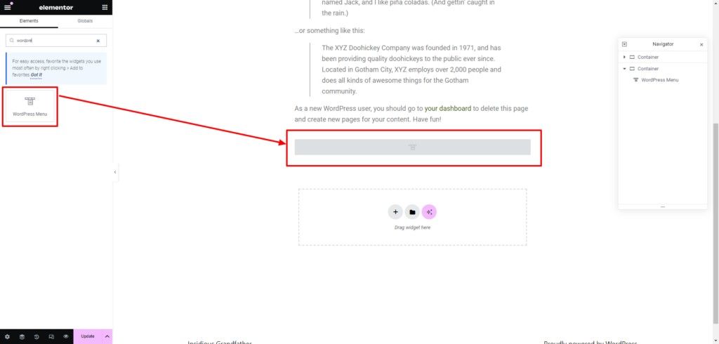
Step 4: Insert the WordPress Menu Widget:
Within the Elements panel, search for the WordPress Menu widget. Drag and drop this widget into the section you created, initiating the integration of the WordPress menu into your Elementor-powered page.
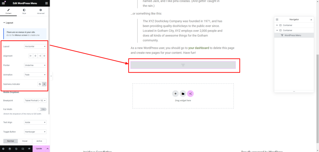
Step 5: Configure Menu Settings:
After successfully adding the WordPress Menu widget to your Elementor-powered page, the next crucial step involves configuring its WordPress settings to tailor the menu’s appearance, behavior, and responsiveness according to your design preferences and website requirements. Follow the detailed breakdown of the three setting options available within the content of this widget:
General Settings:
Upon clicking on the WordPress Menu widget, navigate to the “Content” tab, where you’ll find the “General” settings. This section is a hub for various customization options essential for shaping the foundational aspects of your menu.
- Select Menu: Begin by choosing the specific menu you want to display from the dropdown menu. This option allows you to link your Elementor widget to an existing WordPress menu that you’ve created in the WordPress dashboard.
- Set Maximum Depth: Determine the maximum depth of your menu, which refers to the number of nested levels or sub-menus it can have. This setting helps control the complexity and depth of your navigation structure.
- Alignment: Choose the alignment for your menu items, deciding whether they should be left, center, or right-aligned within the menu container.
- Show Expand Option: Enable or disable the “Show Expand” option. When enabled, it provides a user-friendly feature allowing sub-menu items to expand or collapse upon interaction, enhancing the user experience.
- Adjust Icon Spacing: Fine-tune the spacing between icons associated with your menu items. This customization option ensures precise visual alignment and spacing within your menu.
- Choose Icons from the Library: Elementor integrates an icon library, and in this setting, you can select specific icons to accompany your menu items. Icons can serve as visual cues or embellishments, contributing to a more engaging and aesthetically pleasing menu design.
Responsive Settings:
Within the same “Content” tab, navigate to the “Responsive” settings. This section is pivotal for ensuring that your menu adapts seamlessly to different devices and screen sizes.
- Set Mobile Open and Close Icons: Define the icons that will represent the open and close actions on mobile devices. This enhances mobile user experience by providing clear visual indicators.
- Responsive Breakpoints: Determine the responsive breakpoints, specifying at what screen width the menu transitions to a mobile-friendly design. This ensures a smooth transition and optimal display on various devices.
- Enable Full Width on Mobile: Choose whether your responsive menu should span the full width of the screen on mobile devices. This option maximizes visibility and touch-friendly navigation on smaller screens.
- Adjust Responsive Menu Spacing: Fine-tune the spacing between menu items in the responsive view, ensuring a visually appealing and user-friendly layout on mobile devices.
Advanced Settings:
Still within the “Content” tab, the “Advanced” settings offer more technical customization options for users with HTML proficiency.
- HTML Editing: This feature allows users with HTML knowledge to edit the HTML structure of the menu. It provides advanced customization capabilities for those who want to go beyond the standard options.
- Debugging of Data Types: This option facilitates debugging by displaying data types associated with the menu. It is particularly useful for developers troubleshooting any issues related to data handling within the menu.
Adjust these settings according to your design preferences and website requirements.
Step 6: Customize the Appearance:
This step is crucial in ensuring that the menu not only functions seamlessly but also aligns with the overall design aesthetics of your website. The customization options are conveniently grouped into two main sections: Style and Advanced Settings.
Style Settings:
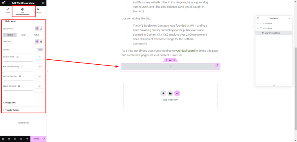
Under the “Style” tab of the WordPress Menu widget settings, users gain access to a plethora of customization options for various elements of the menu. These include:
- Menu: Customize the overall appearance of the main menu, including font styles, colors, and other visual aspects.
- Menu Items: Tailor the styling of individual menu items, controlling factors like font size, color, and spacing.
- Menu Sub-Items: Extend customization to sub-items, ensuring a consistent and visually appealing hierarchy in dropdown menus.
- Menu Sub-Sub-Items: For multi-tiered menus, adjust the styling of sub-sub-items to maintain a cohesive design.
- Menu Sub-Sub-Sub-Items: In cases of intricate menu structures, customize the appearance of sub-sub-sub-items for a polished look.
- Dropdown: Refine the styling of dropdown menus, controlling factors such as background color, border radius, and animation effects.
- Responsive Menu: Ensure a harmonious design on smaller screens by customizing the appearance of the responsive menu.
Advanced Settings:
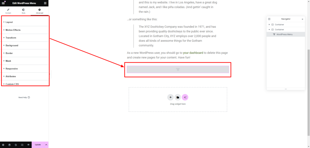
The “Advanced” tab provides users with more granular control over the appearance of the WordPress menu. The customization options include:
- Layout: Adjust the layout of the menu, controlling elements like width, height, and spacing.
- Motion Effects: Introduce dynamic effects to the menu, such as parallax scrolling or entrance animations, enhancing visual appeal.
- Transform: Apply transformations like scale, rotate, or skew to create unique visual effects.
- Background: Customize the background of the menu, incorporating colors, gradients, or images to complement the site’s design.
- Border: Add borders to menu elements, specifying parameters such as width, color, and radius.
- Mask: Employ masking effects for creative and visually engaging menu designs.
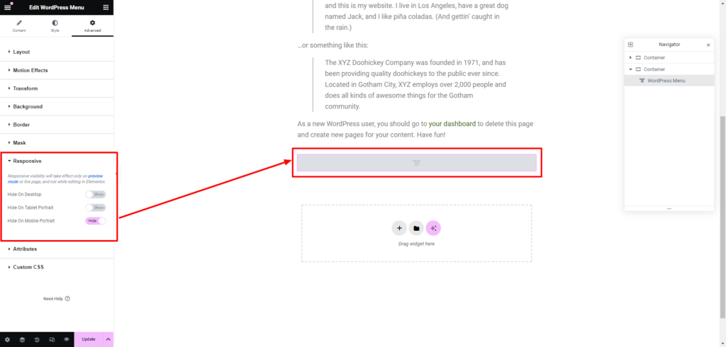
- Responsive: Fine-tune the responsiveness of the menu, ensuring optimal display on various devices.
- Attributes: Define additional attributes for menu elements, providing flexibility in customization.
- Custom CSS: For advanced users, the Custom CSS option allows direct manipulation of the menu’s style using custom code.
By leveraging the Style and Advanced Settings within Elementor’s WordPress Menu widget, designers can elevate the aesthetics of their responsive menu, ensuring it not only meets functional requirements but also integrates seamlessly with the broader design language of the website.
Step 7: Preview and Test Responsiveness:
Before finalizing your menu, use the preview function in Elementor to observe how it appears on different devices. Test its responsiveness by switching between desktop, tablet, and mobile views to ensure a seamless adaptation to various screen sizes.
Step 8: Save and Publish:
Once satisfied with the customization and responsiveness, save your changes within the Elementor editor. After saving, publish the page to make your responsive menu live on your WordPress site.
Step 9: Regularly Update and Optimize:
As you update your site’s content or design elements, revisit the Elementor editor to ensure that your responsive menu remains optimized. Regular maintenance guarantees a consistent and user-friendly experience for your audience across diverse devices.
By following these detailed steps, users with Elementor Pro can successfully create a responsive WordPress menu, elevating the overall navigation experience for visitors on their websites. Elementor’s intuitive interface and advanced Elementor features streamline the process, allowing designers to craft menus that seamlessly adapt to the dynamic landscape of web browsing.
Using A Third-Party Plugin Like Unlimited Elements For Elementor:
Crafting a responsive WordPress menu using a third-party plugin like Unlimited Elements for Elementor introduces a flexible and feature-rich approach to menu customization. In this extensive guide, we will walk through the comprehensive steps involved in leveraging this plugin to create a responsive and visually appealing menu for your WordPress site.
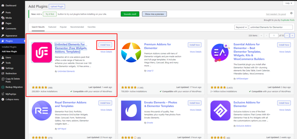
Step 1: Install and Activate Unlimited Elements for Elementor Plugin along with Elementor Free Plugin
Begin by installing and activating the Unlimited Elements for Elementor plugin, ensuring compatibility with the free version of Elementor. This can be done through the WordPress plugins repository or by uploading the plugin files manually. Once activated, you’ll gain access to an extended range of widgets and features that enhance Elementor’s capabilities.
Step 2: Install Widgets for Menu Options
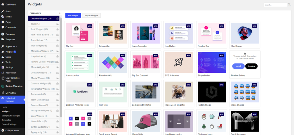
Navigate to the settings of the Unlimited Elements for Elementor plugin. In the widget section, search for menu-related widgets that align with your design preferences. The plugin offers a diverse set of widgets, including Side Menu, Liquid Full-Screen Menu, WordPress Menu, One Page Scroll Navigation, Mega Menu, Circle Menu, and more. Install the widgets that suit your needs, providing you with a versatile toolkit for menu customization.
Step 3: Access the Elementor Editor
Once the necessary widgets are installed, proceed to the page where you want to implement the responsive menu. Click on “Edit with Elementor” to enter the Elementor editor. If you are new to Elementor, the editor provides a user-friendly drag-and-drop interface, simplifying the process of designing and customizing your website.
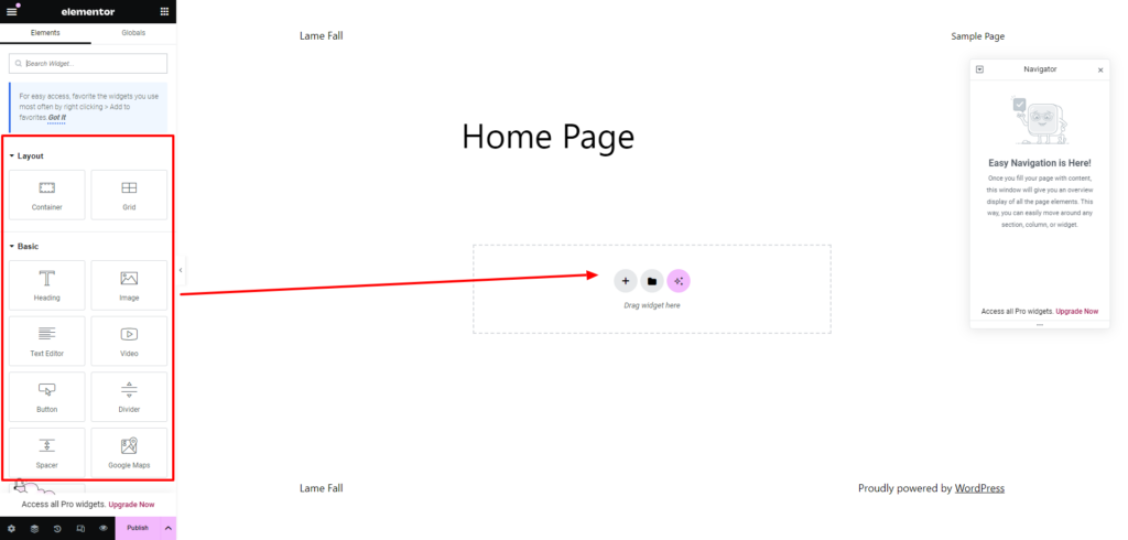
Step 4: Add a New Section and Search for Unlimited Elements Widgets
Within the Elementor editor, create a new section by clicking on the “+” icon. In the Elements panel, now enriched with widgets from Unlimited Elements for Elementor, locate the WordPress menu widget or any other menu-related widgets that align with your design preferences. Drag and drop the chosen widget into the section you just created, initiating the integration of advanced menu options into your Elementor-powered page.
Step 5: Configure Menu Settings
Similar to the Elementor Widget, Click on the newly added WordPress menu widget to access its settings. Unlimited Elements for Elementor typically provides an extensive set of customization options, offering control over menu content, layout, style, and responsiveness. Configure these settings according to your preferences, taking advantage of the extended features provided by the plugin.
Adjustments may include selecting the menu, modifying the layout, choosing different styles for menu items, and more. This step empowers you with a high degree of flexibility to create a unique and visually appealing menu design.
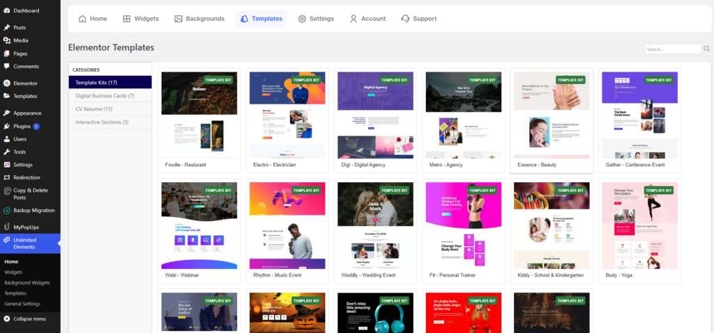
Step 6: Customize Appearance using Unlimited Elements Widgets
Unlimited Elements for Elementor often goes beyond Elementor’s native options, providing additional widgets dedicated to menu customization. Depending on the plugin version and updates, you might encounter widgets designed specifically for menu styles, icons, animations, and other visual elements.
Explore these widgets to enhance the appearance of your responsive menu further. This could include incorporating custom icons, implementing unique hover effects, or adding animated transitions. Leveraging these additional features allows for a heightened level of customization, enabling you to achieve a menu design that seamlessly aligns with your website’s overall aesthetics.
Step 7: Preview and Test Responsiveness
Before finalizing your responsive menu, utilize Elementor’s preview function to evaluate how it appears on different devices. Switch between desktop, tablet, and mobile views to ensure that your menu adjusts seamlessly to various screen sizes. This step is crucial for delivering a consistent and user-friendly experience across devices.
Step 8: Save and Publish
Once satisfied with the customization and responsiveness of your WordPress menu, save your changes within the Elementor editor. After saving, publish the page to make your responsive menu live on your WordPress site.
Step 9: Regularly Update and Optimize
As you update your site’s content or design elements, revisit the Elementor editor and the settings provided by Unlimited Elements for Elementor. Regular maintenance ensures that your responsive menu remains optimized, aligning seamlessly with any changes you make to your website.
Additional Tips and Considerations:
- Explore Widget Add-Ons: Unlimited Elements for Elementor might offer additional widget add-ons that complement the menu customization process. Explore these essential add-ons for Elementor to discover new features and possibilities for enhancing your menu design.
- Stay Updated: Keep the Unlimited Elements for Elementor plugin updated to access the latest features and improvements. Plugin developers often release updates to enhance compatibility and introduce new functionalities.
- Check Documentation and Support: If you encounter any challenges or have specific customization requirements, refer to the plugin’s documentation or seek support from the plugin’s developer community. Many plugins offer forums or support channels to assist users in maximizing their plugin’s potential.
By following these comprehensive steps, users leveraging a third-party plugin like Unlimited Elements for Elementor can create a responsive WordPress menu with advanced customization options. This approach provides a versatile solution for designers and developers seeking features beyond Elementor’s native capabilities, allowing them to tailor the menu precisely to their design preferences and website requirements.
Conclusion
In conclusion, crafting a responsive WordPress menu is an essential aspect of optimizing user experience and ensuring seamless navigation on your website. We began by understanding the significance of a responsive navigation menu in today’s dynamic web environment, acknowledging its role in accommodating diverse devices and improving SEO rankings. Diving into the practical realm, we explored two distinct methods to achieve this goal – first, using Elementor’s native WordPress menu widget, exclusive to the Pro version, and second, leveraging the flexibility of a third-party plugin like Unlimited Elements for Elementor.
Incorporating a premium WordPress theme with an inbuilt responsive WordPress menu can significantly streamline the process of creating a user-friendly website navigation experience. By opting for a WordPress theme bundle that offers this feature, you can ensure that your menu adapts seamlessly to various screen sizes and devices, enhancing accessibility for all visitors. With responsive design becoming increasingly essential in today’s digital landscape, investing in a WordPress theme bundle equipped with built-in responsive menus not only simplifies your workflow but also elevates the efficiency and effectiveness of your website.


