As online businesses strive to create seamless and engaging shopping journeys, the WooCommerce platform stands out as a powerhouse for WordPress users. The release of WooCommerce version 8.5.1 has brought exciting new features, and one noteworthy addition is the block pattern checkout page – a canvas for customization and personalization.
Your WooCommerce checkout page is a crucial touchpoint in the customer journey, representing the final bridge between product selection and completion of a purchase. To truly stand out in the crowded digital marketplace, businesses need to go beyond the default settings and harness the potential of a tailor-made checkout experience.
This blog will guide you through the process to edit WooCommerce checkout page in version 8.5.1, specifically focusing on the innovative block pattern checkout page. We’ll explore how to leverage the power of customization to enhance user experience, streamline the checkout process, and ultimately boost conversions.
Whether you’re a WooCommerce user or a newcomer to the platform, this step-by-step guide will empower you to mold your checkout page into a personalized masterpiece. From adjusting form fields to incorporating brand elements, we’ll unravel the secrets to creating a checkout experience that resonates with your audience and sets your online store apart.
Get ready to edit WooCommerce checkout page and elevate your online store’s user experience to new heights!
What Is The Block Pattern WooCommerce Checkout Page?
The Block Pattern WooCommerce Checkout Page, introduced in the latest release (version 8.5.1 as of January 15, 2024), signifies a revolutionary leap in the way users can customize and design their e-commerce checkout process. Unlike traditional checkout pages, which often involve intricate coding and styling, the block pattern checkout page leverages the block editor in WordPress to simplify the customization experience.
In essence, the block pattern checkout page is built upon the concept of blocks, which are modular components that users can drag and drop onto the canvas. Each block serves a specific function, allowing for the effortless arrangement and rearrangement of elements on the page. This approach enables users to visually structure and style their checkout page without delving into the complexities of coding.
One notable advantage of the block pattern checkout page is its flexibility. Users can easily add, remove, or rearrange blocks to create a checkout page that aligns seamlessly with their brand identity. Whether it’s adjusting the placement of payment options, incorporating trust badges, or showcasing promotional banners, the block pattern checkout page empowers users to fine-tune every aspect of the checkout process.
Moreover, this feature aligns with the broader trend of embracing the WordPress block editor for enhanced content creation and page design. With version 8.5.1, WooCommerce has seamlessly integrated this paradigm into the checkout experience, offering users a more intuitive and visually appealing way to optimize their online store’s final conversion touchpoint. The Block Pattern to edit WooCommerce Checkout Page is a game-changer for businesses seeking a streamlined and personalized approach to online transactions in the ever-evolving e-commerce landscape.
Benefits Of Having Block Pattern To Edit WooCommerce Checkout Page
With the release of WooCommerce version 8.5.1 and the introduction of the Block Pattern Checkout Page, a new era of customization and user experience enhancement has emerged. While this update brings innovative features to the forefront, it’s essential to explore the multitude of benefits that the Block Pattern to edit WooCommerce Checkout Page offers to businesses and their customers.
- Intuitive and Streamlined Customization: The block pattern approach introduces an intuitive and user-friendly method for customizing the WooCommerce checkout page. Businesses can leverage the visual block editor to effortlessly arrange and modify elements on the checkout page, eliminating the need for complex coding. This intuitive customization empowers users to tailor the checkout experience to align seamlessly with their brand identity. More over
- Flexibility in Design: The block pattern checkout page offers unparalleled flexibility in design. Users can easily add, remove, or rearrange blocks to create a checkout page that suits their specific needs. This adaptability allows for quick adjustments to the layout, ensuring that businesses can respond promptly to changing trends or promotional requirements without the need for extensive development work.
- Improved User Experience: A seamless and intuitive checkout process is paramount for a positive user experience. The block pattern checkout page allows businesses to optimize the user journey by strategically placing elements such as trust badges, promotional banners, and essential information. This improved user experience contributes to higher customer satisfaction, reduced cart abandonment, and ultimately, increased conversion rates.
- Enhanced Brand Consistency: Brand consistency is crucial for building trust and recognition. The block pattern checkout page enables businesses to maintain a cohesive brand identity throughout the entire purchasing process. From color schemes to typography and logo placement, every aspect of the checkout page can be customized, ensuring a consistent brand experience that resonates with customers.
- Adaptability to Changing Requirements: E-commerce businesses often need to adapt quickly to changing market conditions or promotional strategies. The block pattern checkout page facilitates this adaptability by allowing users to make on-the-fly changes without relying on developers. Whether it’s updating shipping information, modifying payment options, or incorporating limited-time offers, businesses can stay agile and responsive.
- Effortless Troubleshooting and Bug Fixing: In the scenario where users face issues, the block pattern checkout page simplifies troubleshooting and bug fixing. The modular nature of blocks makes it easier to identify and address issues without disrupting the entire checkout process. This enhances the overall stability and reliability of the checkout page.
- Improved Accessibility and Usability: Accessibility is a critical aspect of web design. The block pattern checkout page is designed with accessibility in mind, ensuring that users of all abilities can navigate and complete the checkout process with ease. This commitment to usability contributes to a more inclusive online shopping experience.
Despite these numerous benefits, it’s essential to address specific concerns raised by users after the WooCommerce 8.5.1 update. Let’s Check out some Limitations of Block Pattern to edit WooCommerce Checkout Page.
Limitations Of Having Block Pattern To Edit WooCommerce Checkout Page
While this addition offers a plethora of benefits, it’s crucial to delve into the limitations that users may encounter when navigating the Block Pattern to edit WooCommerce Checkout Page.
- Limited Plugin Compatibility: One significant limitation lies in the compatibility with third-party plugins. Users accustomed to a wide range of plugins, especially those catering to specific functionalities like payment gateways or additional checkout options, may find that some plugins are not yet adapted to the block pattern structure. This can pose challenges for businesses relying on these plugins to streamline their checkout process, potentially disrupting the seamless flow of transactions.
- Delayed Plugin Development: Following the release of major updates, it often takes time for developers to adapt their plugins to the new structure. As a result, users may experience delays in accessing crucial functionalities until plugins are updated to be compatible with the Block Pattern Checkout Page. This lag in development can be particularly impactful for businesses that heavily rely on specific plugins for payment processing, shipping, or other essential aspects of their online store.
- Incomplete Support for Popular Payment Gateways: While WooCommerce is known for its versatility in supporting various payment gateways, the Block Pattern Checkout Page may currently lack full support for some widely used gateways. Notably, users have reported issues with PayPal integration, a popular and widely utilized payment gateway. This limitation can be a considerable drawback for businesses that prioritize offering diverse payment options to their customers.
- Complexity in Field Placement: The Block Pattern Checkout Page introduces a new field placement system, which, while providing flexibility, may also lead to complexity in certain scenarios. Users have reported challenges in maintaining a logical and intuitive order of fields, particularly when the “Bill to separate address” option is checked. This can result in confusion for customers and hinder the overall user experience during the checkout process.
- Challenges in Troubleshooting: The modular nature of the block pattern structure, while beneficial in many aspects, can pose challenges when troubleshooting issues. Users have reported difficulties in identifying and resolving bugs or layout problems, especially when attempting to address issues related to specific fields or the overall structure of the checkout page. This can potentially prolong the time required for issue resolution and increase the complexity of debugging processes.
- Learning Curve for Users: While the block pattern approach aims to simplify the customization process, it may still present a learning curve for users accustomed to the traditional method of customizing checkout pages. Users who are not familiar with the Gutenberg WordPress block editor may need time to adapt to the new interface and understand how to effectively utilize blocks to achieve their desired layout and design.
- Customization Complexity for Non-Technical Users: While the block pattern checkout page provides a visually intuitive way to customize the checkout process, non-technical users may still find certain aspects of customization challenging. Achieving specific design or layout requirements may require a level of technical proficiency or understanding of the block editor, potentially excluding some users who prefer a more straightforward and user-friendly customization process.
- Potential Impact on Existing Workflows: Businesses with established workflows and procedures for managing their WooCommerce stores may face disruptions when transitioning to the Block Pattern Checkout Page. Existing procedures for handling checkout-related tasks, such as order processing or customer communication, may need to be adapted to accommodate the changes introduced by the block pattern structure, potentially causing temporary inefficiencies.
- Compatibility with Themes: The successful implementation of the Block Pattern Checkout Page may also depend on the theme used by the WooCommerce store. Some users have reported compatibility issues with certain themes, which may affect the visual coherence and responsiveness of the checkout page. Ensuring seamless integration with a wide range of WordPress Elementor themes remains a challenge that developers need to address to provide a consistent experience for users.
- Accessibility Concerns: While efforts have been made to design the block pattern checkout page with accessibility in mind, users have raised concerns about potential accessibility issues. Ensuring that the block pattern structure complies with accessibility standards and guidelines is crucial for providing an inclusive shopping experience for users with disabilities.
As WooCommerce continues to evolve, addressing these challenges and collaborating on solutions will be instrumental in ensuring that the platform remains a reliable and user-friendly choice for businesses of all sizes. The ongoing dialogue between users and developers will play a pivotal role in refining the Block Pattern Checkout Page and maintaining WooCommerce’s position as a leading e-commerce solution.
How To Edit WooCommerce Checkout Page?
To edit WooCommerce Checkout Page using the Block Pattern in version 8.5.1 is a straightforward and empowering process that allows users to customize their online store’s checkout experience seamlessly. Here’s a detailed guide on how to navigate and leverage the Block Pattern Checkout Page to modify the appearance and content of your WooCommerce checkout page:
Step 1: Install Or Update To WooCommerce 8.5.1
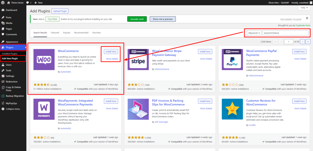
In the initial step to edit WooCommerce Checkout Page using the Block Pattern in version 8.5.1, it is crucial to confirm that you have the appropriate WooCommerce version installed or updated. This process begins by accessing your WordPress dashboard and navigating to the Plugins section. If WooCommerce version 8.5.1 is not yet installed, you can seamlessly add it to your WordPress setup by conducting a quick search within the Plugins section.
For users who already have a previous version of WooCommerce installed, the transition to version 8.5.1 involves a straightforward update process. Within the WordPress dashboard, locate the Plugins section, find WooCommerce in the list of installed plugins, and proceed to update it to the latest version, which is 8.5.1 in this case. Besides seeing all of these functionalities of the Woocommerce it makes it one of the best Ecommerce plugins for WordPress.
By ensuring that your WooCommerce installation aligns with or is updated to version 8.5.1, you set the foundation for unlocking the features and capabilities associated with the Block Pattern Checkout Page. This step lays the groundwork for a seamless and efficient customization journey tailored to your online store’s needs and preferences.
Step 2: Access The Block Editor For The Checkout Page
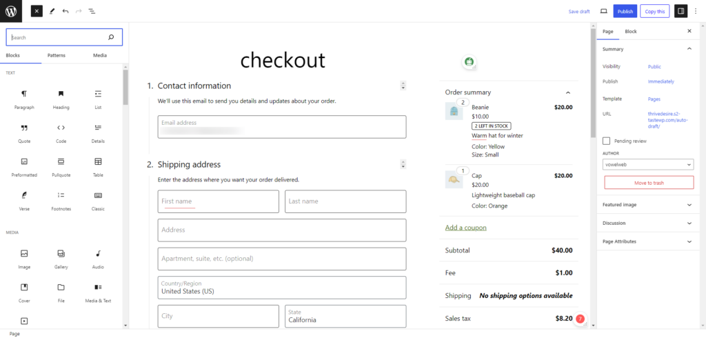
After successfully installing or updating to edit WooCommerce version 8.5.1, the next crucial step is to access the dedicated block editor for the checkout page. Begin by logging into your WordPress dashboard, where you’ll find a menu on the left-hand side. Navigate to the “Pages” section, and within the list of pages, locate the “Checkout” page automatically created by WooCommerce.
Once you’ve identified the “Checkout” page, click on the “Edit” button associated with that page. This action directs you to the block editor, a specialized editing environment tailored for the checkout page. The block editor employs a modular, block-based approach, allowing you to modify and enhance different sections of the checkout page seamlessly.
This dedicated block editor is designed to simplify the customization process, providing an intuitive interface where you can visually adjust and organize various elements on the checkout page. By clicking “Edit,” you gain direct access to this powerful tool, empowering you to shape the checkout experience according to your preferences, branding, and business requirements.
Step 3: Edit Blocks
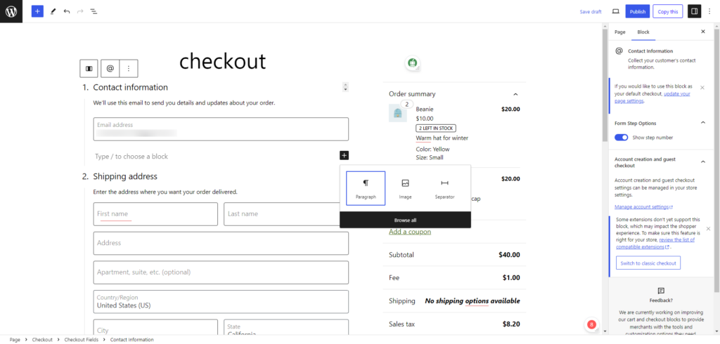
Now that you are in the block editor, you can start making modifications to the blocks on your checkout page. The Block Pattern to edit Woocommerce Checkout Page operates on the principle of blocks, providing a modular and intuitive approach to customization.
- Modify Existing Blocks: Begin by clicking on the existing blocks within the editor to initiate modifications. This feature empowers users to refine the content and appearance of individual blocks, providing a granular level of control over elements on the checkout page. Whether it’s altering text, images, or adjusting various settings, this functionality ensures that the checkout page aligns seamlessly with your brand and meets your specific preferences.
- Add New Blocks: To enhance both functionality and aesthetics, users can easily incorporate new blocks into the checkout page. Click on the “+” button within the editor, and utilize the search bar to locate the specific block you wish to include. Whether you’re adding additional information, promotional banners, or other elements, the block editor’s user-friendly interface offers flexibility, allowing for the seamless integration of various blocks to enrich the checkout page.
Rearrange Blocks: Controlling the flow and layout of the checkout page is made effortlessly intuitive by the ability to drag and drop blocks within the editor. This feature facilitates the structuring of the page in a way that optimally guides customers through the checkout process. By rearranging blocks, users can create a logical and visually appealing sequence, ensuring a smooth and engaging user experience for shoppers navigating the checkout journey.
Step 4: Customize Design
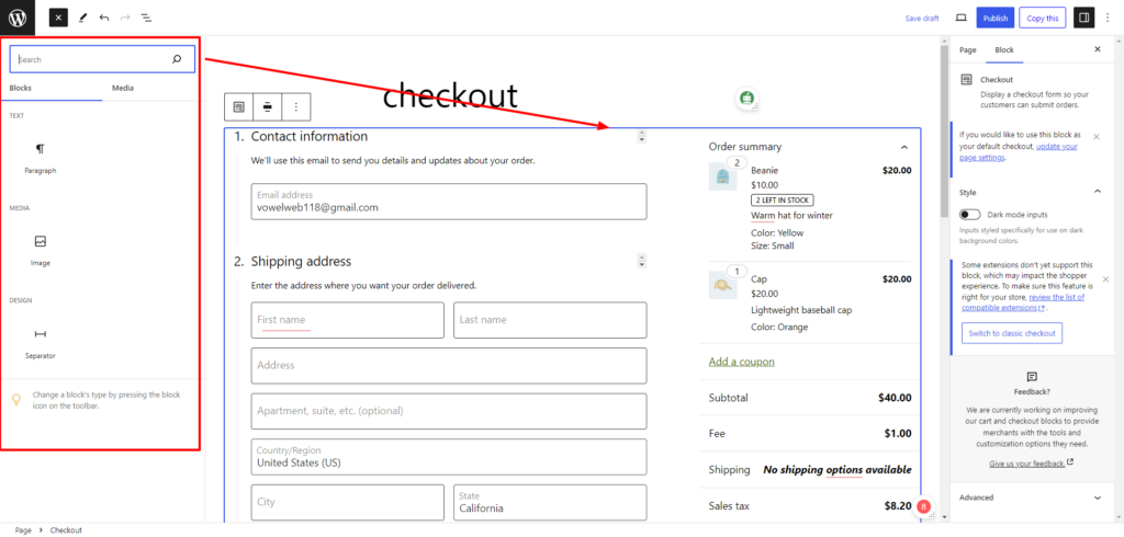
Explore the customization options available for each block to ensure a cohesive and branded look for your checkout page. The block pattern to edit Woocommerce checkout page offers flexibility in design, allowing you to adapt it to your business’s unique identity and goals.
- Change Colors, Fonts, and Styles: The Block Pattern Checkout Page provides a rich palette of customization options, enabling users to modify the appearance of individual blocks. By adjusting colors, fonts, and styles, you can seamlessly integrate your checkout page with the overall brand theme. This customization not only reinforces brand consistency but also contributes to a visually cohesive and engaging user experience. Whether aligning with established brand guidelines or exploring new design elements, this flexibility ensures that the checkout page becomes an extension of your brand identity.
- Configure Checkout Process Settings: Beyond visual aesthetics, certain blocks encompass specific settings related to the checkout process itself. These settings might include options for the order summary, billing details, and shipping preferences. Customizing these settings is crucial to tailoring the checkout experience to align precisely with your business requirements. For example, you can streamline the order summary presentation, adjust billing information fields, or fine-tune shipping options. This level of customization ensures a seamless transaction experience for your customers, enhancing the overall efficiency and satisfaction during the checkout process. By using all of the block pattern you can also design your website’s custom pages in WordPress.
By delving into the customization options offered by the Block Pattern Checkout Page, businesses can transcend generic templates and curate a checkout experience that not only reflects their brand identity but also optimally serves the needs and expectations of their customers. This step marks a significant stride towards creating a unique and tailored online shopping journey that stands out in the competitive e-commerce landscape.
Step 5: Preview Changes
Before finalizing your edits, use the “Preview” button within the editor to see how your changes will impact the appearance of the checkout page. This preview functionality is crucial for making adjustments and ensuring a seamless and visually appealing user experience. Consider the placement of elements and evaluate how they contribute to the overall flow of the checkout process.
Step 6: Save Changes
Once you are satisfied with the edits and have successfully previewed them, it’s time to save your changes. Click either the “Save” or “Publish” button within the editor to apply the customized checkout page to your live website. This ensures that the changes are visible to your customers when they proceed to make a purchase.
By following these straightforward steps, you can harness the power of the Block Pattern to edit WooCommerce Checkout Page to create a unique and optimized checkout experience for your customers. The block pattern approach not only simplifies the customization process but also empowers you to adapt the checkout page to align seamlessly with your brand identity and business goals. This user-friendly approach ensures that businesses of all sizes can leverage the latest WooCommerce features to enhance their online store’s checkout experience.
Conclusion
In conclusion, delving into the world to edit WooCommerce checkout page customization has revealed a dynamic landscape defined by the revolutionary Block Pattern WooCommerce Checkout Page. We’ve explored its benefits, providing users with unparalleled flexibility in design, improved user experiences, and the ability to adapt seamlessly to changing business requirements. However, it’s crucial to acknowledge the limitations, such as plugin compatibility challenges and the learning curve for non-technical users. Overall you can customize the WooCommerce checkout page easily and also integrate it with the Premium WordPress themes or the WordPress theme bundle.
Nevertheless, armed with a comprehensive guide on how to edit WooCommerce Checkout Page using the block pattern, businesses can navigate these intricacies. Following the step-by-step process empowers users to tailor their online store’s checkout experience, ensuring a visually cohesive, brand-aligned, and user-friendly final touchpoint for customers. As e-commerce evolves, embracing the capabilities of WooCommerce’s block pattern checkout page offers businesses a powerful tool for crafting a unique and optimized online shopping journey.


